

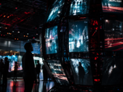



Project Hail Mary visuals are already sparking conversation among film fans and cinematography watchers alike. Fresh comments from Oscar-winning cinematographer Greig Fraser reveal how the Ryan Gosling sci-fi hit built its distinctive look by blending nostalgic 1980s references, emotional color contrast, and carefully designed transitions between Earth and deep space.
Speaking during the ToruńCamerimage Film Festival, Fraser reflected on his collaboration with directors Phil Lord and Christopher Miller, explaining how long-shared pop culture touchstones helped shape the film’s visual language. The result is a blockbuster that feels technically precise yet emotionally familiar, giving audiences a sci-fi adventure with warmth, mystery, and cinematic texture.
How Greig Fraser designed the Project Hail Mary visuals
Fraser, known for Dune, The Batman, and other visually ambitious projects, said working with Lord and Miller had been a natural creative fit. While the directing duo is known for jumping across genres, Fraser pointed to a consistent underlying sensibility in their work — one rooted in the films, cartoons, and storytelling rhythms they grew up with.
That shared cultural vocabulary became central to the Project Hail Mary visuals. According to Fraser, conversations about the film repeatedly circled back to 1980s pop culture. Rather than imitate older movies directly, the team wanted to translate the feeling of that era into a modern cinematic language.
Among the more surprising influences was Scooby-Doo. Fraser said discussions about how to move between the film’s space-set present and Earth-bound flashbacks led to talk of the cartoon’s famous stylized transitions. The filmmakers were not aiming for anything literal or gimmicky, but that reference helped them define the sensation they wanted: a memory shift that feels playful, recognizable, and slightly uncanny.
A modern technique inspired by retro feeling
To evoke that sense of movement, Fraser used a mis-timed shutter to create subtle image streaking during transitions. It is a technical decision with emotional payoff. Instead of using a generic flashback cue, the film reportedly gives viewers a visual bridge that feels connected to the story’s tone and to the protagonist’s fragmented perspective.
This approach is one reason the Project Hail Mary visuals stand out. They do more than separate timelines; they help audiences feel the difference between memory and survival, between the familiarity of home and the disorientation of space.
Why Earth and space look so different in Project Hail Mary
One of Fraser’s clearest creative goals was to distinguish the movie’s two timelines through temperature and mood. Space was designed to feel cooler, while Earth was treated with more warmth. On paper, that sounds like a classic sci-fi contrast, but Fraser emphasized that the balance had to be more nuanced than a simple cold-versus-warm visual trope.
Earth may represent what the hero is fighting for, but it is not a carefree world. In the story, Earth is under threat from a sun-dimming parasite, so the movie could not lean too heavily into comforting nostalgia. At the same time, Fraser wanted those memories to feel inviting enough that viewers would understand their emotional weight.
That tension shapes the Project Hail Mary visuals in important ways:
- Space scenes carry a cooler tone, reinforcing isolation and uncertainty.
- Earth scenes feel warmer, suggesting memory, longing, and purpose.
- The overall palette avoids becoming oppressively bleak, preserving a sense of adventure.
This is especially important in a film expected to run at blockbuster scale. Fraser noted that the audience still needs to enjoy the experience, even within a story built around planetary danger and personal confusion.
The Ryan Gosling opening scene was built to misdirect viewers
A key insight from Fraser concerns the film’s opening. When Ryan Gosling’s character wakes up aboard a spaceship with no immediate understanding of where he is, the filmmakers wanted the moment to avoid standard sci-fi imagery. Fraser said they specifically did not want the set to read like a laboratory or a hard-edged futuristic chamber.
Instead, the goal was something closer to a luxury hotel or high-end wellness retreat. That decision makes the opening more psychologically effective. Rather than instantly signaling “space movie,” it places the audience in the same unsettled frame of mind as the character.
It is a smart storytelling move, and it deepens the Project Hail Mary visuals beyond spectacle. Production design, lighting, and camera placement are used not just to impress but to withhold certainty. The visual world itself becomes part of the mystery.
The Empire Strikes Back reference
Fraser also highlighted a CG shot that reveals Gosling’s character as a tiny figure framed within the spacecraft. That composition was inspired in part by The Empire Strikes Back, specifically imagery of small figures seen through windows during moments of vastness and transition.
References like this help explain why the Project Hail Mary visuals feel both contemporary and classic. They are not nostalgic copy-and-paste gestures. Instead, they work as cinematic echoes — visual memories embedded inside a new story.
What this means for sci-fi cinematography
Fraser’s comments offer a valuable window into how large-scale science fiction is evolving. Today’s best genre films are not built on visual effects alone. They succeed when technical choices, emotional tone, and cultural memory all reinforce one another.
For filmmakers and fans, there are several takeaways:
- Pop culture references can guide tone without becoming parody.
- Color temperature remains a powerful narrative tool when used with restraint.
- Transitions matter, especially in films with dual timelines.
- Audience disorientation can be intentional and dramatically effective.
In that sense, the Project Hail Mary visuals are not just about style. They show how cinematography can shape memory, suspense, and emotional connection inside a major studio release.
Read more:
Explore more:
- Explore more stories on Human of Dublin
- Explore culture and features on Luxe Digest
- Explore trending coverage on Daily Digest
Conclusion
The big lesson from Fraser’s comments is that Project Hail Mary visuals were crafted with far more than surface-level polish in mind. By combining retro-inspired references, carefully controlled color contrast, and a deliberate sense of visual disorientation, the film creates a world that feels epic, intimate, and emotionally legible all at once. For viewers, that means a sci-fi spectacle with personality; for filmmakers, it is a reminder that the strongest images often come from translating shared cultural memories into something entirely new.